Introduction
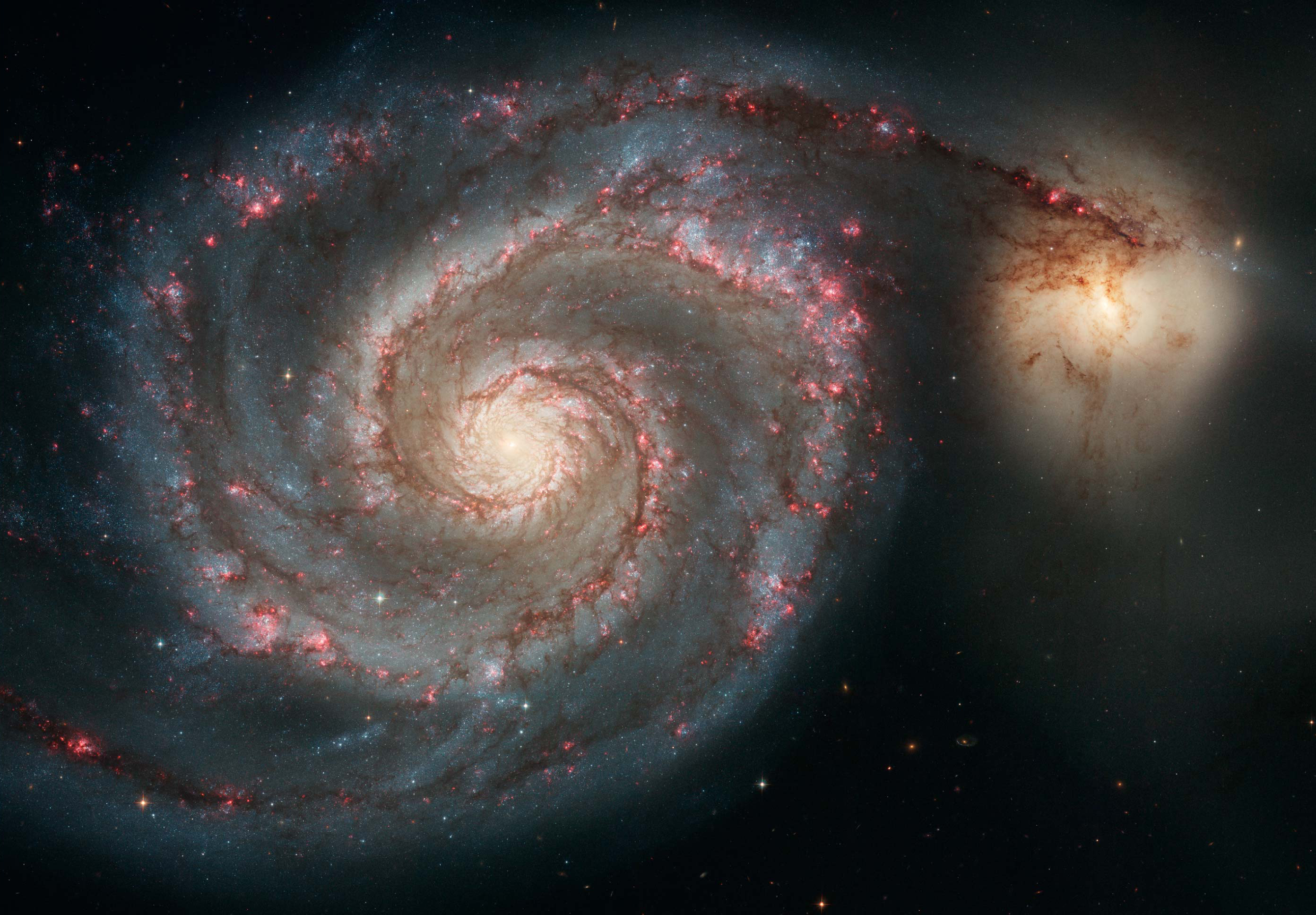
If you've ever seen images of spiral galaxies, you might have noticed glowing red or pink spots sprinkled throughout (figure 1). These galactic neon lights are actually clouds of hydrogen gas, lit up by the intense radiation of young, massive stars. The process is similar to how neon signs work -- except instead of electricity exciting the gas, it's starlight! If starlight is responsible for these glowing regions, can a neural network predict them?
To separate the starlight from the light emitted by the gas, we need to split the total light coming from a galaxy into
its constituent wavelengths. This is called a spectrum. Most of the light comes from stars, which produce a smooth spectrum,
and the neon lights coming from gas appear as spikes on top of the smooth spectrum.
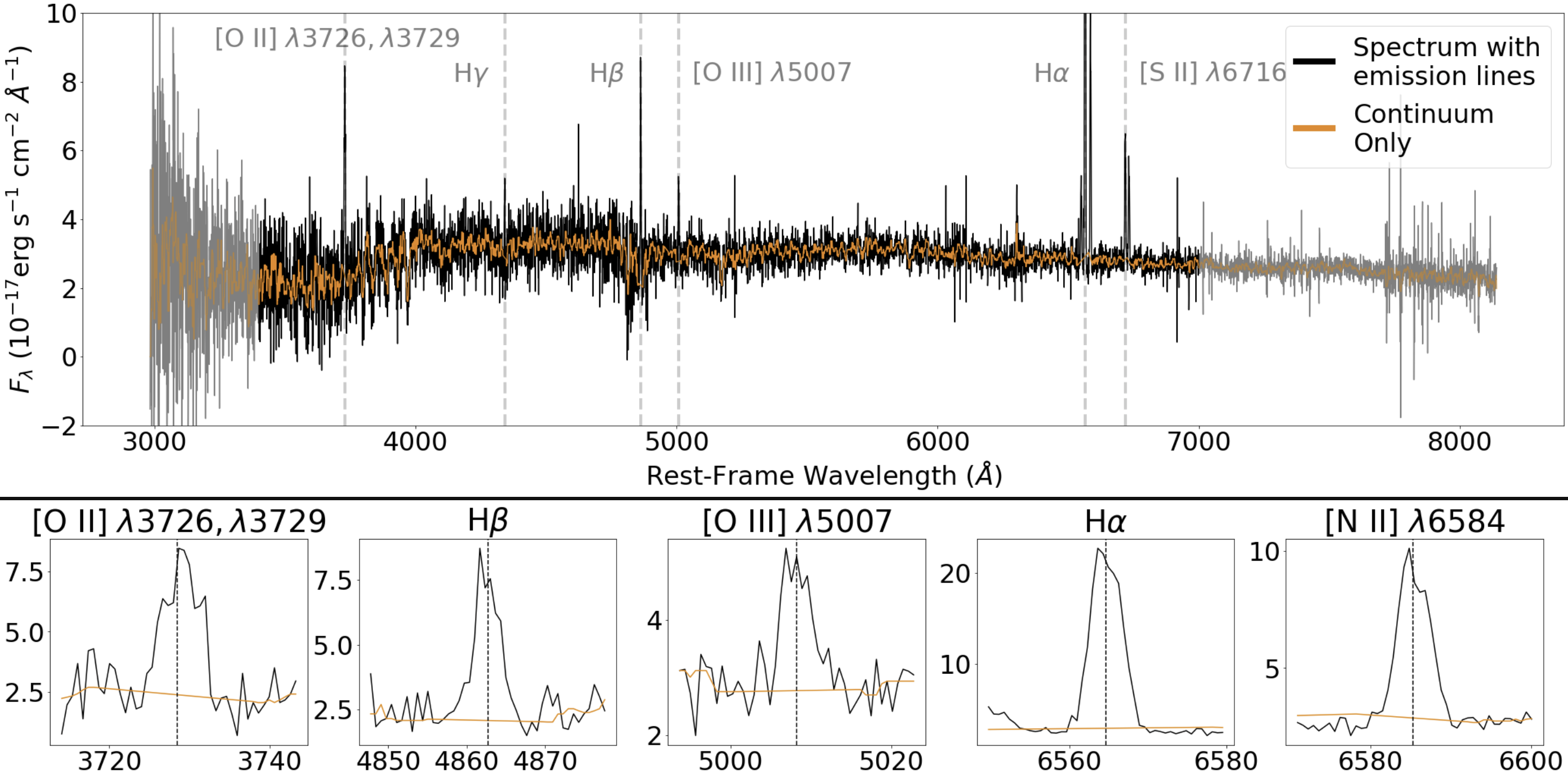
These spikes are called emission lines. Figure 2 shows an example DESI spectrum (more on DESI below), with orange showing starlight
and black showing starlight + emission lines.
We expect these two sources to be strongly correlated, as emission lines are produced when the gas is ionized
by the light emitted from the stars, and the starlight holds information on the history of star formation of the galaxy, which is what determines the content
of the gas. In this work, we trained a neural network to predict the neon lights from starlight.
Data
The Dark Energy Spectroscopic Instrument (DESI)
is a 5000-fiber spectrograph installed on the Mayall 4m telescope at Kitt Peak National Observatory. It is a remarkable
instrument that can obtain roughly 5000 galaxy spectra at the same time! Over the course of 5 years of operation, DESI obtained
47 million spectra and created the largest 3D map of our Universe to date!
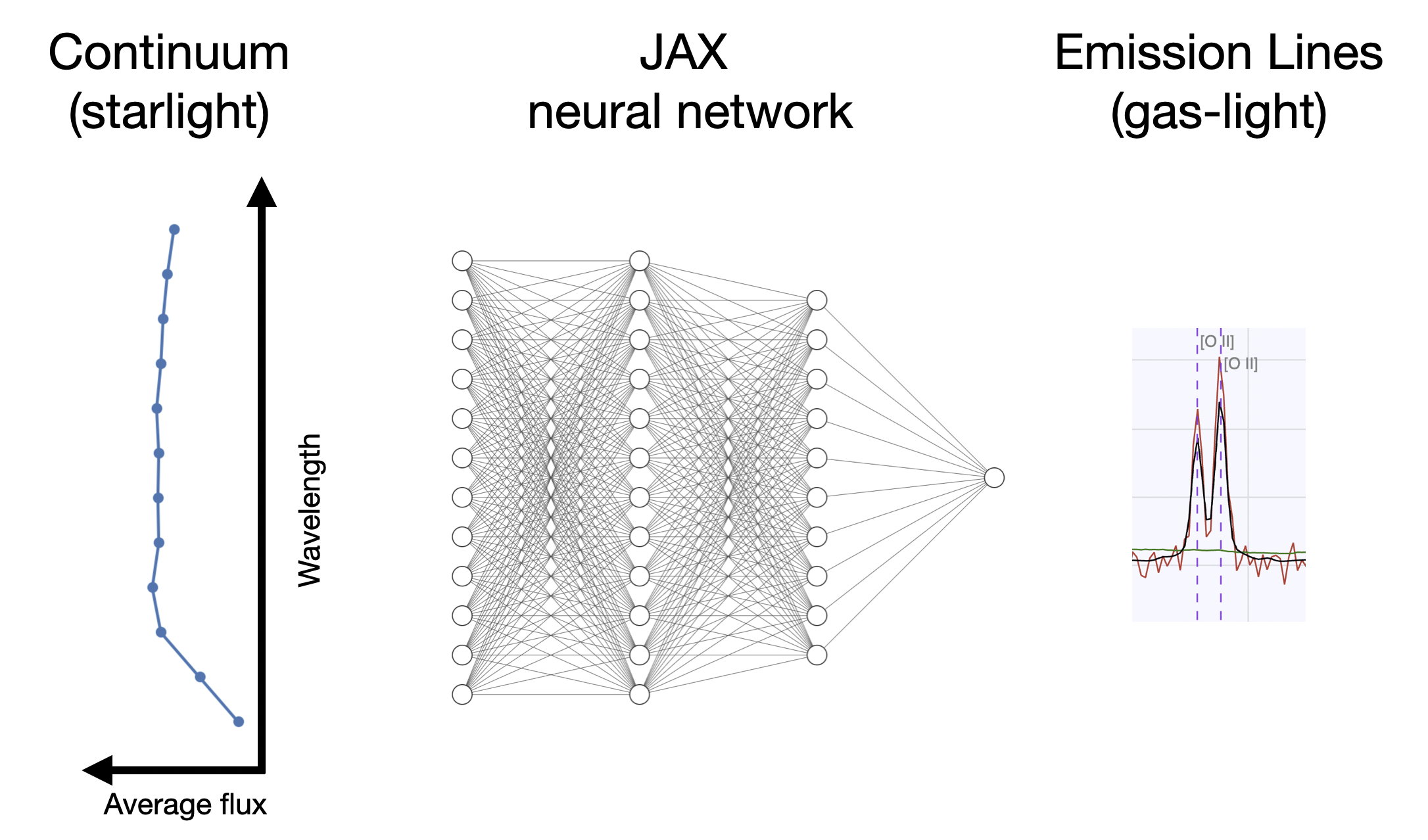
We used these spectra (a small subset of them, not 47 million!) to train a JAX-implemented neural network to predict the strengths of emision lines (or neon lights)
of galaxies from their starlight.
Before training, we needed to pre-process the data.
Given DESI's spectral resolution, each spectrum has ~10,000 pixels. In other words, each spectrum can be thought of as a point in 10,000-dimensional space.
The curse of dimensionality makes it difficult to train a neural network
in such a high-dimensional space with limited training set size. Besides, there's a lot of noise in the spectrum (small random spikes) that we would like to throw away -- we only care
about the smooth shape of the continuum. To achieve this, we averaged the flux in 12 consecutive top-hat bins, reducing the dimensionality
from ~10,000 to only 12! This not only drastically reduces the dimensionality, but also increases the signal-to-noise ratio.
1
In addition, we represent the strength of each emission line by a single number called the
Equivalent Width (EW).
If you want more details on this, check out my paper.
In summary, we reduced the complicated high-dimensional problem into a simpler one, where the continuum is represented by 12 numbers (average fluxes),
and each emission line is represented by a single number (its strength, or EW).
Method
One of the goals of this work was to use our DESI-trained neural network to add realistic emission lines on synthetically generated continua.
Both the continuum generation pipeline and our emission-line add-on must be fast, differentiable, and scalable, as together they can be used
to model large populations of galaxies and infer population distributions of physical parameters.
There already exists a continuum generating pipeline which satisfies these requirements, called
DSPS,
and it is implemented in JAX.
To be compatible with DSPS, we also trained our neural network in JAX (checkout my implementation on
Github).
Results
The traditional, quantitative way of analyzing these results would be to plot the predicted emission line EWs versus
the true EWs, and see how close the points are to the 1-to-1 diagonal line. We do this in
my paper, along with
calculating robust statistical metrics such as the spearman correlation coefficient and normalized median absolute deviation.
Our network outperforms traditional methods that use Principal Component Analysis (PCA) and k-NN, while also being ~400x faster,
because inference with neural networks is very fast (amortized inference)!
Here, I want to talk about another way we analyzed the results, which is less quantiative but I believe more insightful. Ideally,
we would like to see performance as a function of input -- i.e., for different galaxy populations with different continua, how well
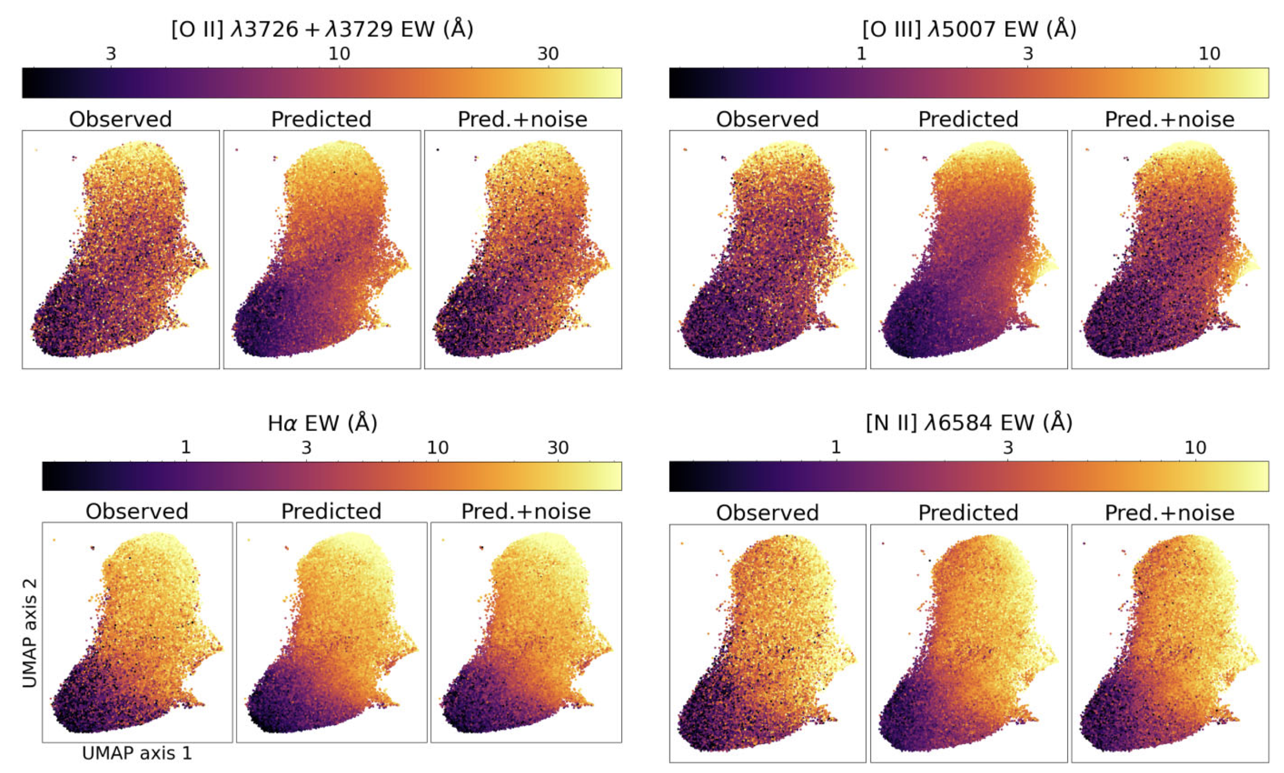
is our network doing? To achieve this, we used UMAP to reduce
the 12-dimensional continuum space into two dimensions. With these 2D embeddings, we made scatter plots color-coded with the true emission line
strength and predicted emission line strength.
Figure 4 shows the 2D UMAP embeddings of the continua color-coded with emission line strength. First, in the "observed"
panels, we see that there are gradients in emission line strength. Different parts of UMAP space, corresponding to different types of galaxies,
have different emission line strengths. This is good! Otherwise, we wouldn't be able to train a network to predict emission lines from continua.
However, we see that there's a lot of noise and scatter in these trends (the ocassional black point in a sea of yellow and orange points and vice versa). These appear
for two main reasons: 1) knowing the galaxy continuum will not exactly tell you the emission lines, because they also depend on the properties of
the gas in the galaxy (which is not captured by the continua), and 2) astrophysical data is noisy. The emission line measurements are not perfect, and there's
a good amount of uncertainty on the values. This is the case for many astrophysical datasets, making applications of ML in astronomy particularly challenging.
The "predicted" panels show much smoother trends across this UMAP space. This is also good! It means our model is not overfitting, and the predictions are roughly
the average values of the true emission line EWs in local neighborhoods. Interestingly, when we add noise to our predictions (pred. + noise panels), we recover
some of the scatter that we see in the "observed" panels. This is crucial if we want to generate emission lines that look realistic and noisy. Notice that
this behavior is not the same in all panels. For example, noise in [OII] (top left) is more prominent, because it is harder to measure.
Now, you may be wondering, what are the different populations of galaxies across this UMAP space? You can discover this yourself by playing around with an interactive plot that I made using Dash and Plotly. It can be accessed with this link (it might take a moment to load, and the UMAP figure is inverted, sorry!). To first order, galaxies can be separated into "red" and "blue". Red galaxies are old, dead, and do not form any new stars. Blue galaxies are young, alive, and forming new stars. Which ones do you think will have stronger emission lines? Can you locate them in this UMAP space?
If you would like to play around with the model and use it to add emission lines on your continua, you can find more information on my Github, and please feel free to reach out to my email!
- Averaging over broad wavelength bins also suppresses correlated noise from sky subtraction and detector systematics that would otherwise survive pixel-level averaging. ↩